Home Projects About Resume


PetFeast

UI/UX Design, Responsive Design, Front-End

INTRODUCTION

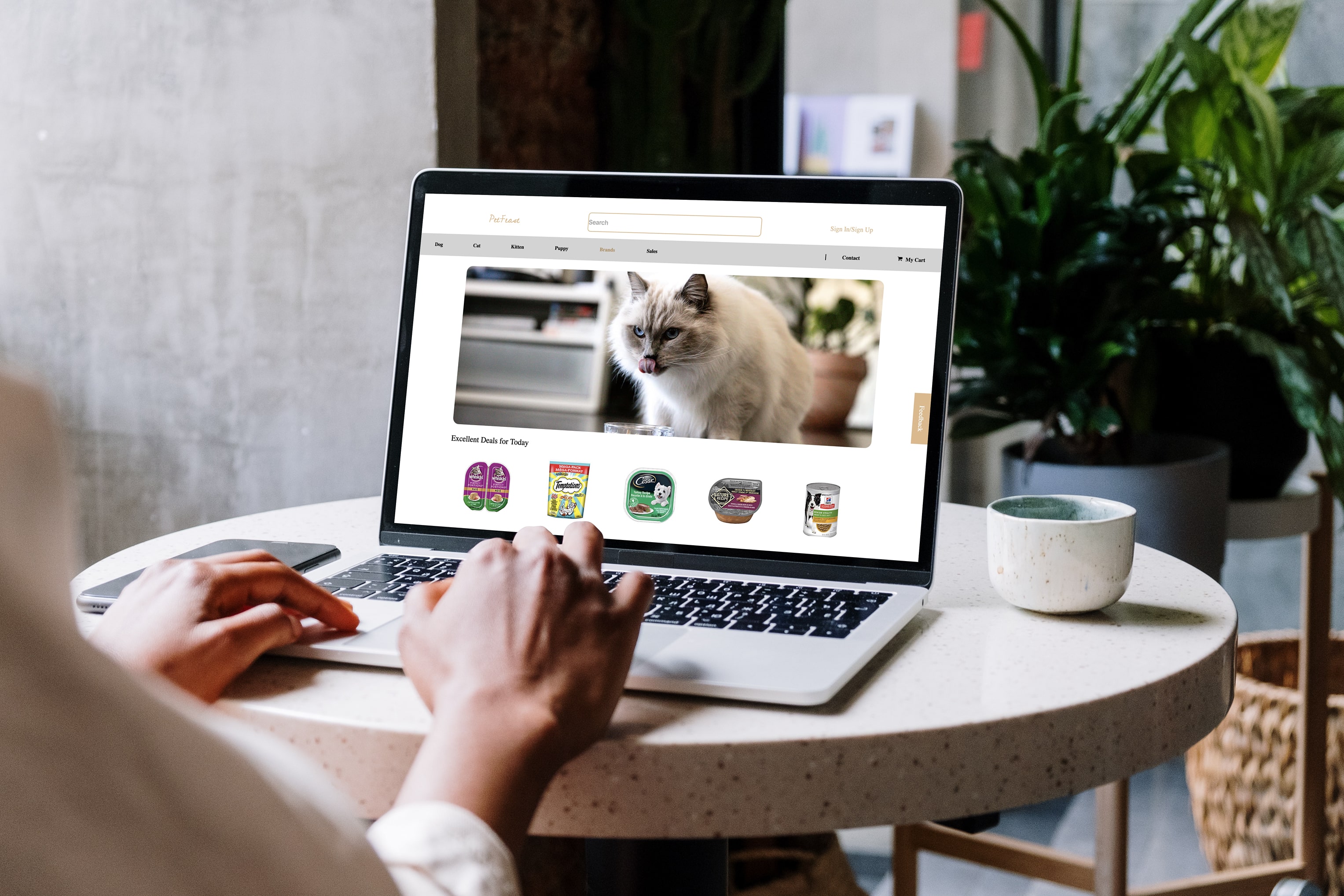
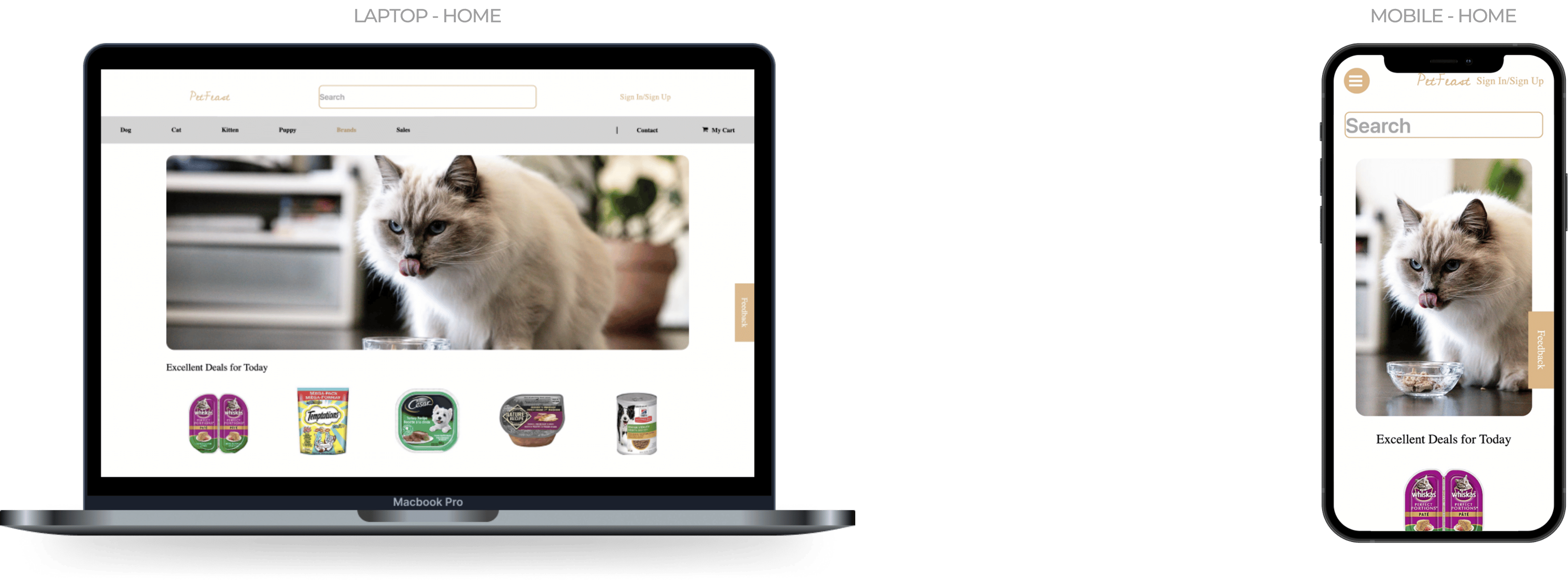
PetFeast is an online store specializing in a diverse selection of pet appliances and products from leading brands, dedicated to meeting the needs of pet owners with common pet types in local communities.

This project is designed to enhance the online shopping experience for pet owners by incorporating an intuitive user interface, responsive design, and optimized website speed.

MY ROLE

As a front-end developer and UI/UX designer for this individual project, I focus on building the website using HTML, CSS, JS, and jQuery. Aditionally, I designed an intuitive user interface and seamless online shopping experience that integrates all key aspects to optimize user engagement and satisfaction.

PROJECT DELIVERABLES

Prototypes

TIMELINE

November 2023 (Two weeks)

PROJECT SCOPE

1 Front-End Developer, 1 UI/UX Designer

TOOLS

Adobe CC, Canva, VS Code

Online Pet Store - PetFeast
A modern, intuitive, and clean redesign of online pet stores.
Explore essential pet products online.
Customer Support
Contact customer service anytime for support and inquiries.
  • Quickly submit feedback to customer service in just a few easy steps.
  • Submit information confidently with the form validation feature that prevents errors.
Login / Signup
Enjoy quick PetFeast signup and anytime login access.
  • Toggle between Login and Signup with intuitive UI layouts and seamless transition.
  • Register and log in confidently with the form validation feature that provides guidance and prevents errors.
Mobile Responsiveness
Providing users with the best experience on any electronic device.
PetFeast offers essential daily items for pets, ensuring customers can shop anytime, anywhere, and on any device. The site features responsive design, adapting to all major screen sizes for an optimal user experience.

Home

Signin / Signup

Project Takeaways
A deeper understanding of integrating responsive design into websites to enhance user experience.
Upon completing this project, I gained valuable insights into implementing responsive design with media queries. Initially, I prioritized desktop-first development, not realizing the extensive work required to adapt the design for smaller screens. This approach significantly prolonged the development process. Moving forward, I will adopt a mobile-first strategy to streamline responsiveness across all devices. Additionally, I plan to utilize front-end frameworks like React and Vue to facilitate more efficient and effective responsive design integration.
Next project

View

Fiction

Moments often slip away unnoticed.