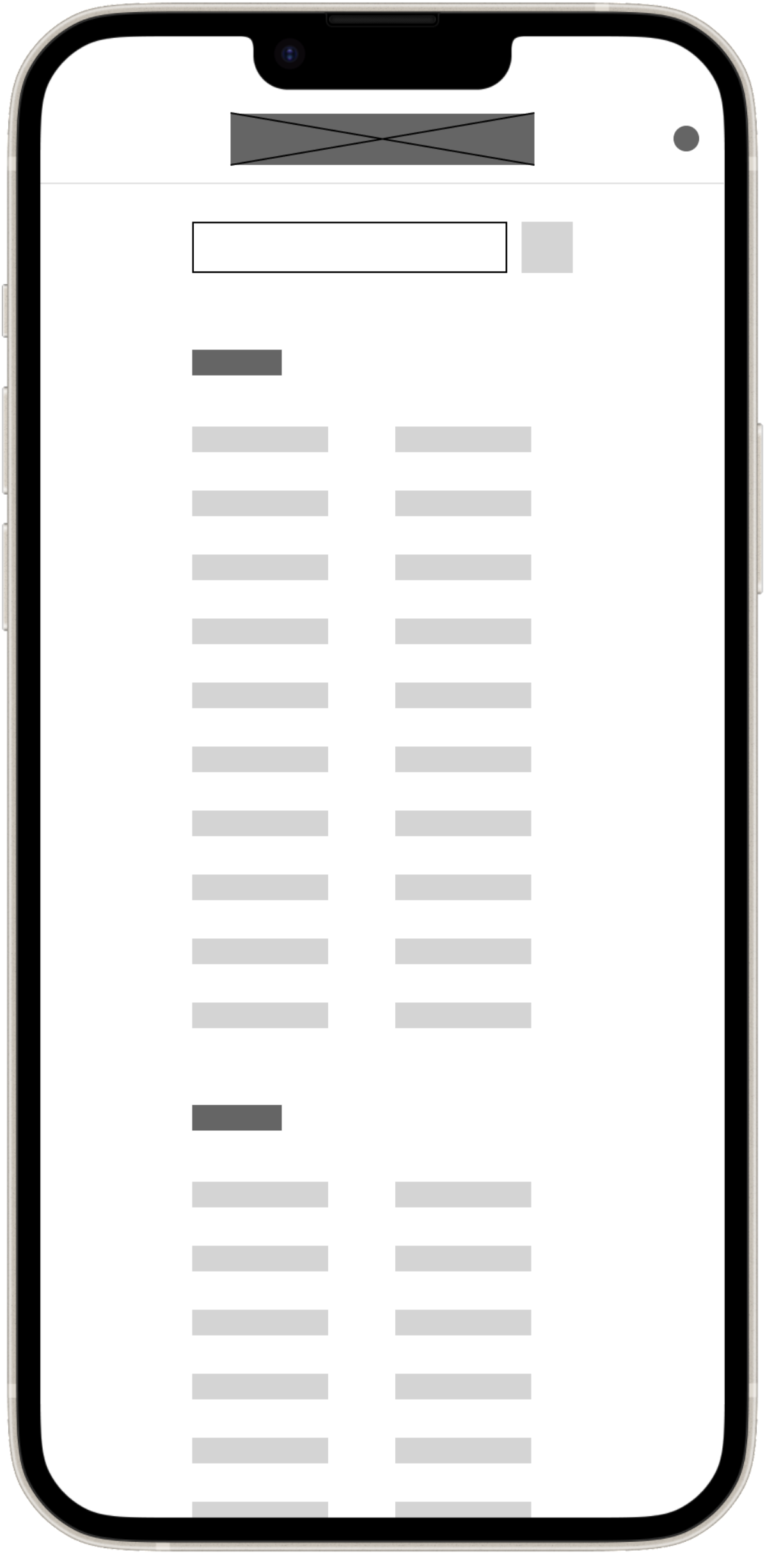
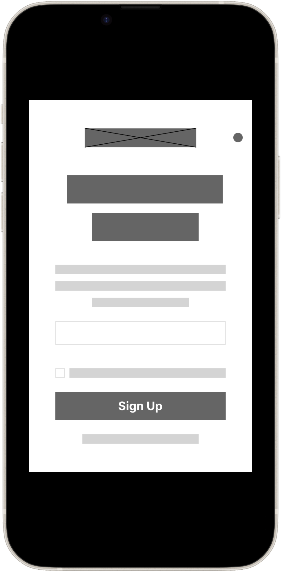
Initially, during the wireframing phase of the design process, I was confident that I could complete the entire project quickly after outlining the structure and layout of the news website. However, I soon realized that creating the design library in Figma required significantly more time. I spent considerable time refining font styles, buttons, colors, and alignments.
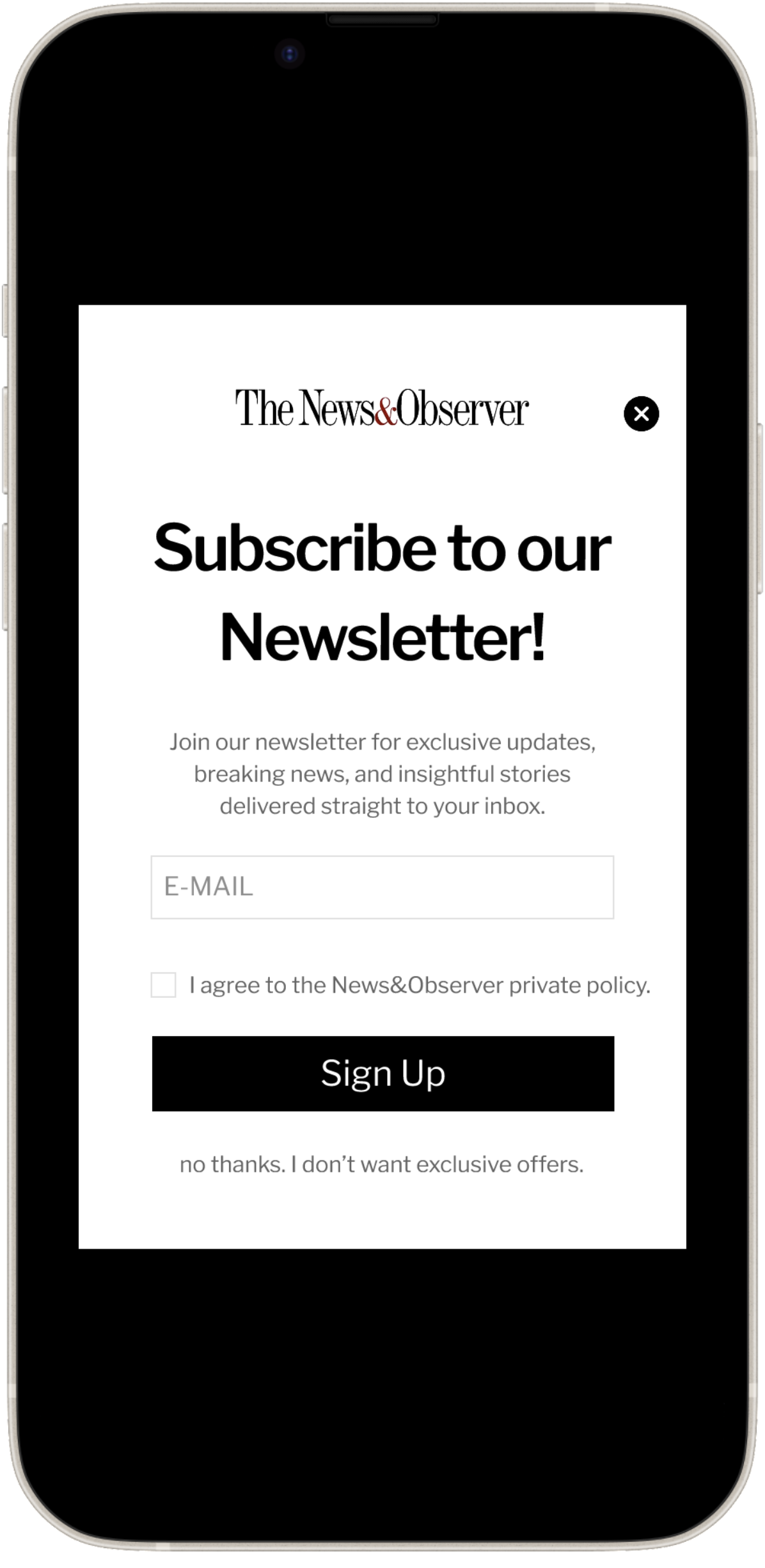
Establishing a clear typographic hierarchy was just as important as the content hierarchy, and I focused on finding the optimal balance for text, graphics, and alignments to ensure an elegant design. After testing the prototype with several users, I learned that simplicity is key, as users prefer an easy-to-use interface over a complex one.
The News & Observer
UI/UX Design
Disclaimer: All articles and graphics used in this prototype are from online resource libraries.
INTRODUCTION
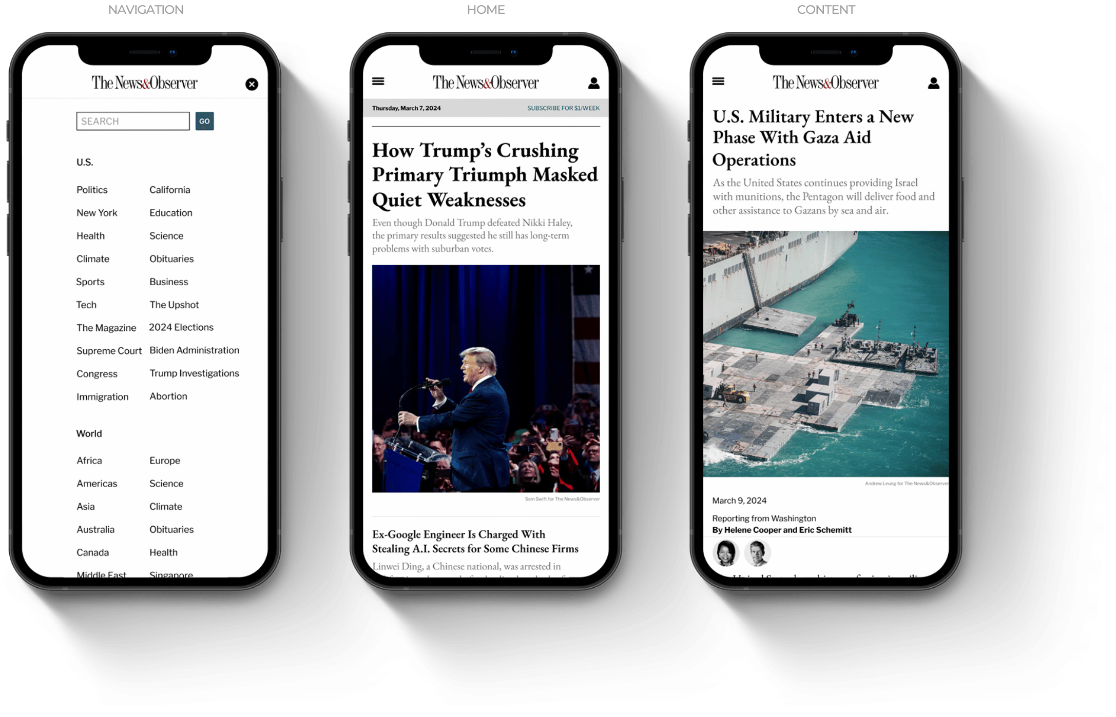
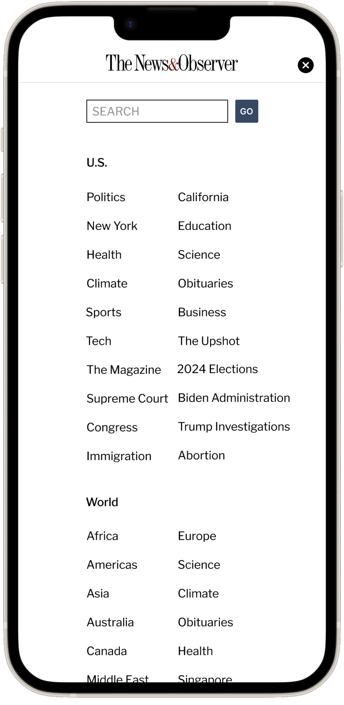
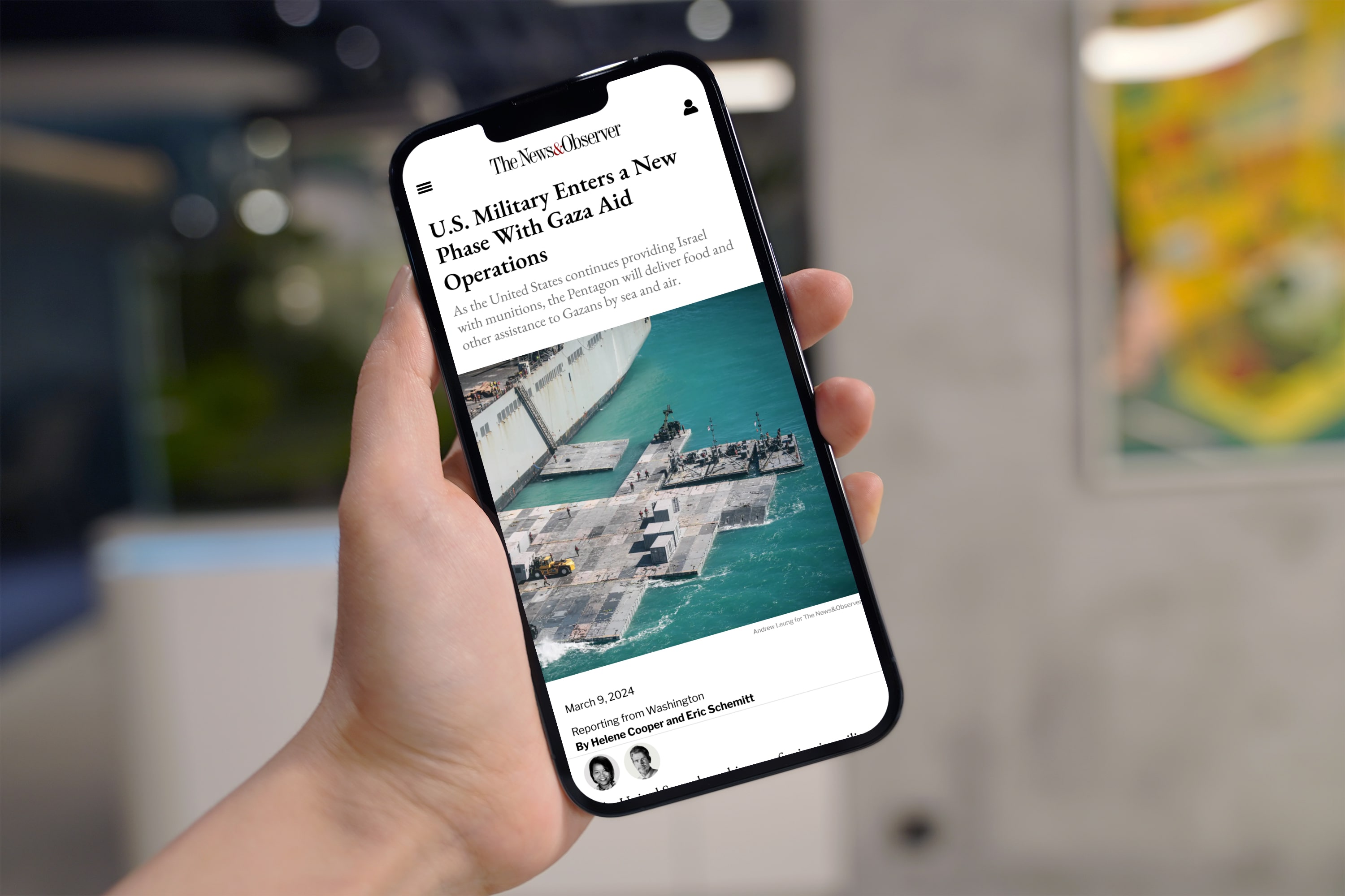
The News & Observer is a design-led initiative focused on creating a media news website that enables users to quickly and efficiently navigate the content they seek. The project emphasizes a clear and engaging content hierarchy, clean typography, and a user interface that delivers a thoughtful and seamless user experience.
MY ROLE
This is a self-initiated project in which I designed the media news website from the ground up, managing all aspects from product scoping and user flows to wireframes, design finalization, and rapid prototyping. Additionally, I conducted user research to produce viable ideas and solutions to potential problems.
PROJECT DELIVERABLES
Wireframes, Final Design, Prototypes
TIMELINE
March 2024 - April 2024 (One month)
PROJECT SCOPE
1 UI/UX Designer
TOOLS
Figma, Adobe CC, Canva
